|
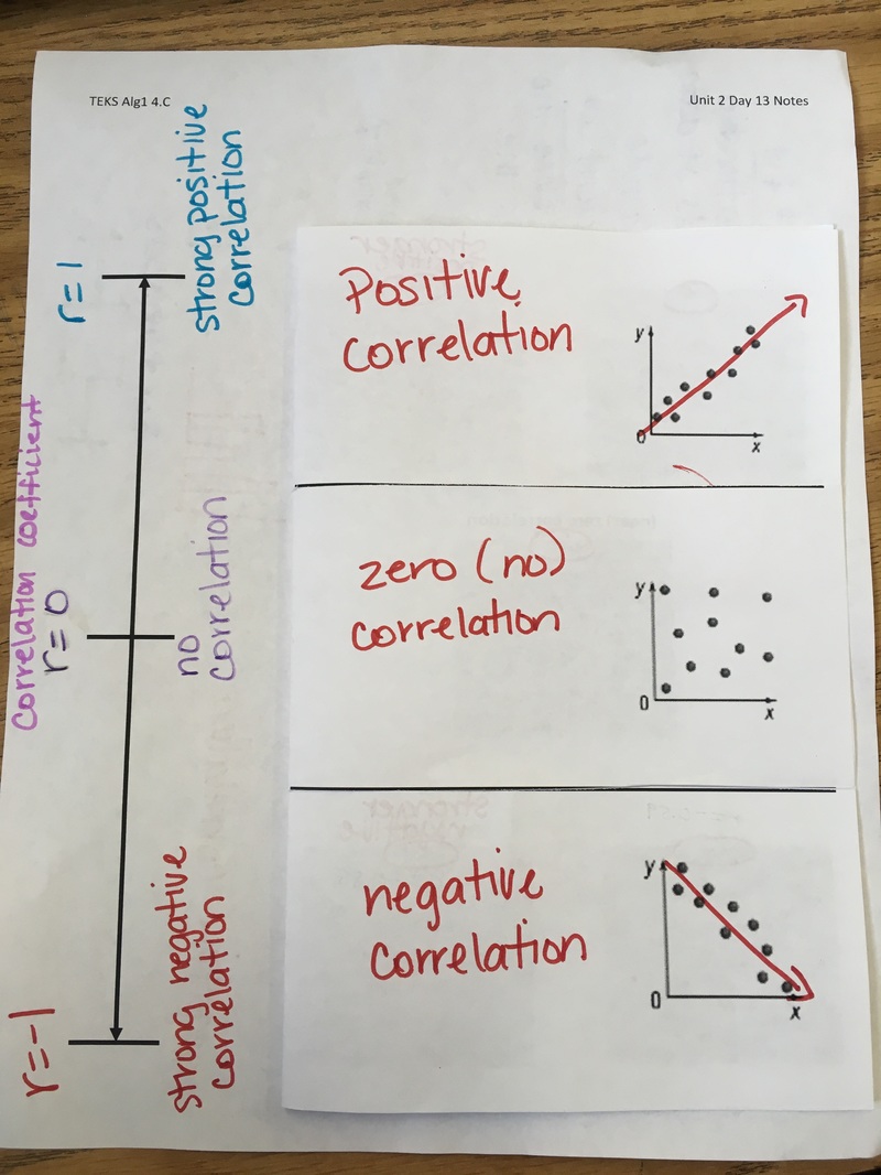
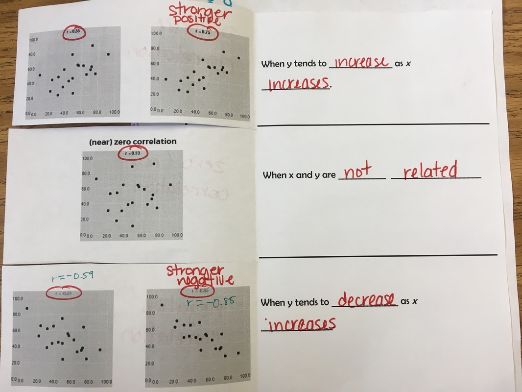
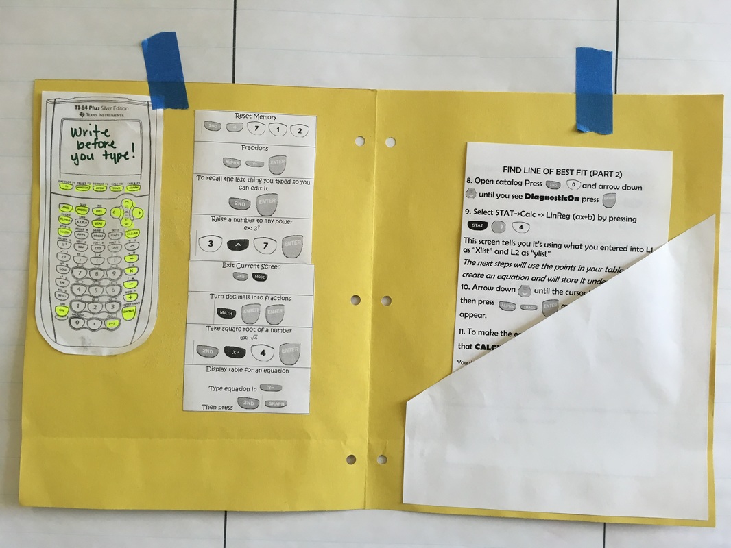
Our district pacing allows only for two days to a lot of information around scatter plots - correlation coefficient as a measure of the strength of the linear association, and writing linear functions and interpolation and extrapolation. When I was planning I was looking for a way to organize a lot of information and definitions. I like to use foldables and I found a great one - and variations of one - from Math = love (one of my go to places when planning) but I wasn't able to fine just one to cover all the information needed. I remembered I did a Frayer Model for slope so I pulled that out again for scatter plots and it worked great! I also wanted to talk about correlation more so I did use a foldable for that. I introduced scatter plots by using 4 scatter plots with no numbers - just the plots- and partnering students and giving them a uncooked/dry spaghetti noodle to try to create a line. Up until then we'd only been working with linear functions. They were able to do so fairly easily for positive and negative correlation but when they got to no correlation graphs, they had a lot of questions about where they should put the noodle. Later when we talked about line of best fit was made easier because I just referenced the "spaghetti". 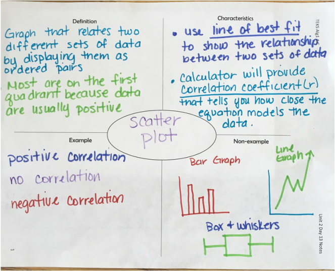 After this, we worked out a few problems and since correlation coefficient is coming straight from their calculator for my students (we use TI-84), I created a Calculator Scatter Plot Tips sheet for their Calculator Tips section. My students use an "interactive binder" - pros and cons - so I had them create a Calculator Tips section in their binder. 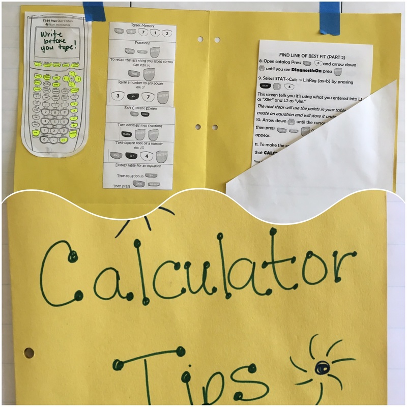 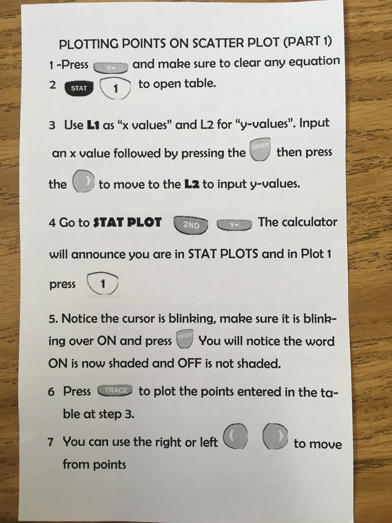 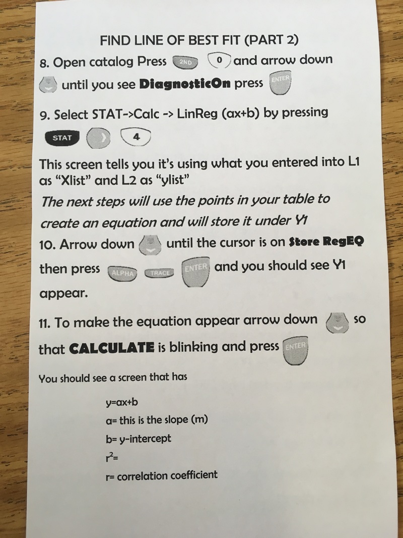 My files are here.
0 Comments
Leave a Reply. |
Corina CantuI teach Algebra 1 in Houston, TX to amazing 8th graders. ArchivesCategories |
 RSS Feed
